
Overview
Zelthy is a HealthTech start-up offering a cloud platform used by pharmaceutical companies and healthcare organizations worldwide. Its proprietary framework and data models enable the rapid setup of patient program applications in a secure cloud environment. The platform supports multiple initiatives—including access, assistance, support, and therapy initiation—impacting the lives of over 200,000 patients.
Possible Goal
To redesign Zelthy’s website in a way that aligns with both business goals and user needs:
To increase prospective leads
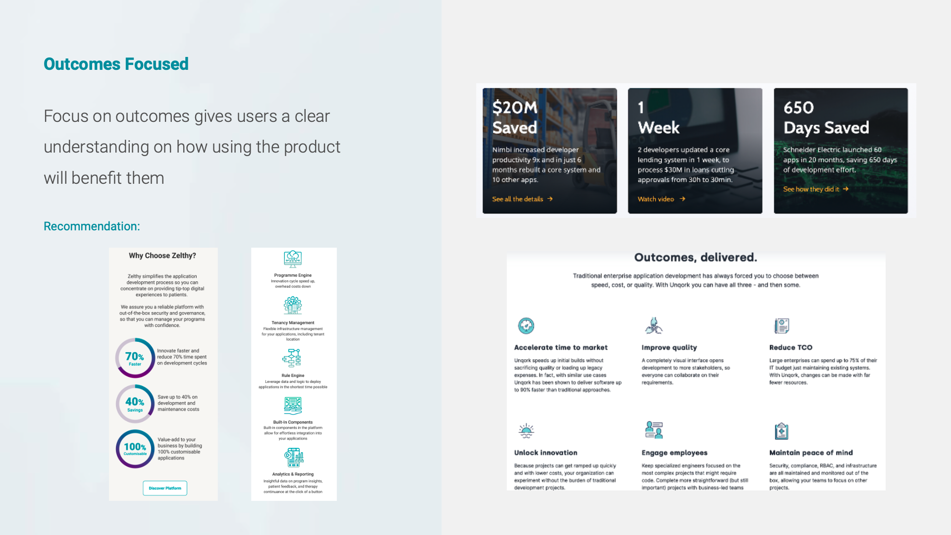
To accurately portray platform, solutions, and business
To attract prospective employees
Course
General Assembly - UXDI25
Project Team Size
4-person design team
My Role
User Interview, UI Design, Prototyping, Usability Testing
Project Duration
3 weeks
Tools
Photoshop, Figma, Pen & Paper
Empathising Users’ Needs & Habits
We aimed to design and bring the client’s idea to life as a product that delivers real value to users. Our research focused on answering the following questions:
How do people currently go about finding out information on a PaaS website?
What attracts the best employees to join a company?
Comparative & Competitive Analysis
We began with general research on the healthcare industry and organizations using Platform-as-a-Service (PaaS) and/or Software-as-a-Service (SaaS). We then conducted detailed comparative and competitive analyses. From all the platforms we reviewed, we selected five that best matched the client’s criteria:


User Interviews
Aligned with our research goals, we conducted nine user interviews to better understand the behaviors, thoughts, and feelings of users visiting PaaS websites, as well as those seeking job opportunities. From this research, we created an affinity diagram, which we then distilled into the following key insights for clarity:

Through our user interviews, we gathered these key insights about users:
✘ Information overload; users have to sieve through the information that is irrelevant to them when evaluating the company’s suitability and relevance
✘ Inability to understand technical information, or to relate product features to their needs
✘ Not being able to contact Zelthy easily for discussions on collaborations or job opportunity related matters
We developed two personas to address the distinct needs, goals, and frustrations of the Prospective Client and the Prospective Employee. Chariya, the Prospective Client, seeks the quickest way to learn about products and offerings, while Adi, the Prospective Employee, wants a thorough understanding of the company and its culture before deciding to join.


Defining Research
Next, we translated these research insights into a clear Problem Statement and corresponding Solution Statement:


The proposed solution is to add more content and a dedicated career page, enabling Chariya and Adi to explore and gather information tailored to their interests and needs. The application map below illustrates how this would integrate into Zelthy’s existing sitemap.


Ideating Solutions
User Flow
The next step was to outline the user flow, illustrating the potential steps for both personas. This flow served as a blueprint for determining which pages to design during the wireframing stage.


Wireframes
We created low-fidelity wireframes for the new Zelthy feature to ensure users clearly understood its purpose and how to interact with the interface.
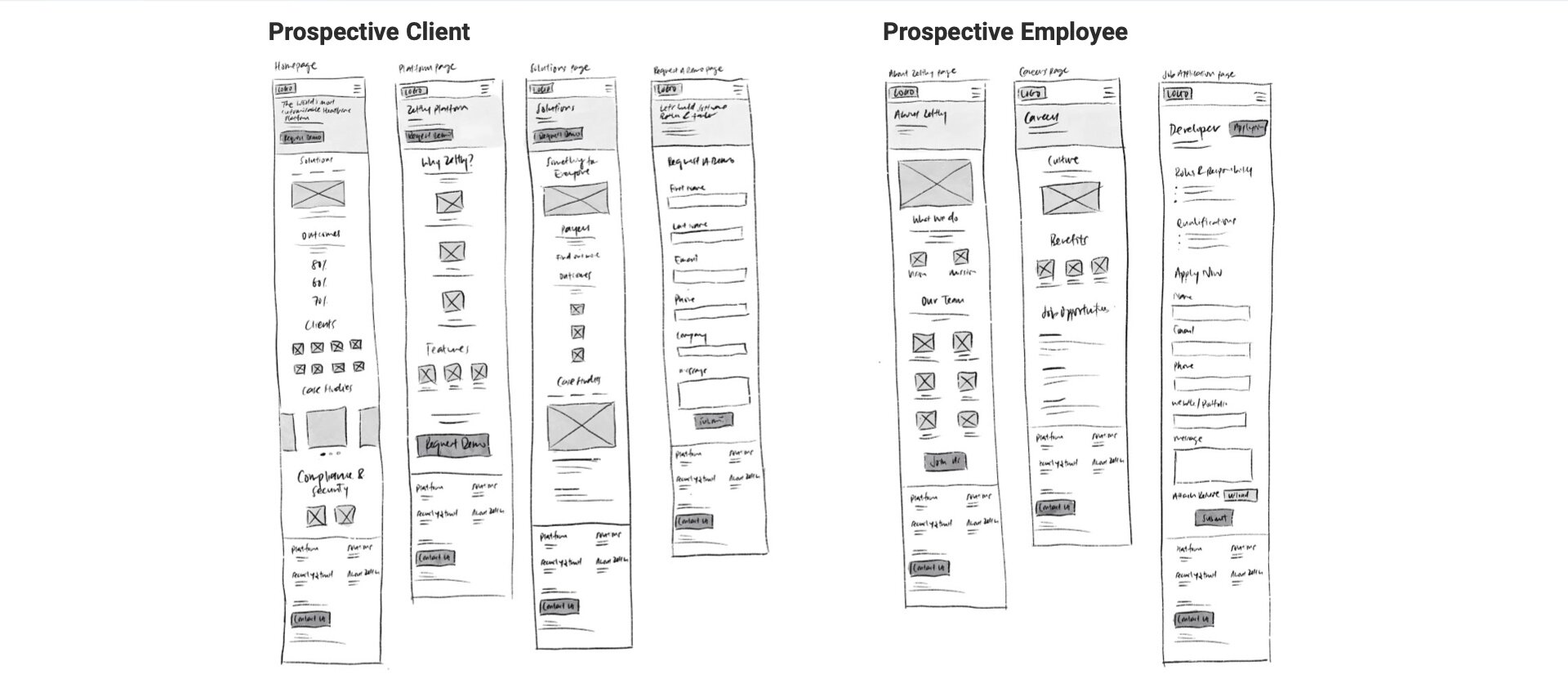
After sketching initial concepts, we developed mid-fidelity wireframes. With our personas in mind, we focused on organizing and presenting information so that Chariya and Adi could easily find what they needed. Key solutions included an improved navigational sitemap and strategically placed content with supporting UI elements.

Style Guide
Once we established a consistent visual language, we created a new web style guide and component library. As a team, we iterated and built out the library to ensure consistency across all site elements, including brand colors, typography, and design components.

Testing & Iterating
After applying the UI elements to the wireframes, we developed a high-fidelity prototype in Figma. We then conducted two rounds of remote usability tests via Zoom, each with five users, to observe how they interacted with the website and gauge their overall experience.
Testing Objectives:
Find a suitable solution and request a demo within 5 mins with 0 errors
Find a suitable position and apply for the position within 5 mins with 0 errors
Key Findings for #1 Usability Test

Key Recommendations for #1 Usability Test
Add career page as secondary navigation for easy access
To add client logos, testimonials across various pages to build users’ trust & assurance towards Zelthy
Rewrite “Solutions” header and body copy in the Homepage
Add “Back to top” link in the case study page
Add chatbot


Key Findings for #2 Usability Test

SUS Score: 87.5 (Grade A)
View usability test report here
Key Recommendations for #2 Usability Test
To redesign the “Our Team” section to make it more intuitive for users to click to find out more
To redesign client & employee testimonials section to allow users easy access to read all testimonials
To declutter the “Solutions” section on the homepage
To add a CTA button that gives users easy access to the Platform page
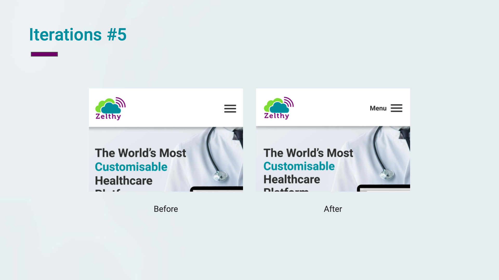
To add the word “Menu” beside the hamburger menu


Final Designs

View mobile prototype here
To demonstrate responsive design, we also created high-fidelity wireframes for desktop screens. Due to time constraints, we were only able to include pages with limited interactive elements.

View desktop prototype here
Learning Reviews
This project was my first experience working on a real client engagement. Within the given timeline, our team prioritized gathering feedback and insights, applying Lean UX techniques to make quick, informed decisions. It was valuable to involve both the client and developers throughout the brainstorming and design process. I also learned that even seemingly simple features can be complex to implement, highlighting the importance of clear communication between designers, clients, and developers.
Next Steps
Include Zelthy’s brand story, key milestones on the “About Us” page
Create easy access to case studies
Design “Client” page that includes collaborations and testimonials
Incorporate more engaging video content
Create responsive web design to respond to more users’ behaviour and environment
Conduct more testing on revised designs, get feedback, refine designs and iterate as necessary