

Overview
City Music has been part of Singapore’s music scene since the early days of modern music-making, growing alongside the local music industry. Building on this legacy, I aim to enhance the City Music website to better showcase its products while preserving and strengthening the brand’s identity.
Possible Goal
To revamp the City Music website with intuitive navigation, enabling music enthusiasts to easily search for and purchase products that meet their needs, while delivering a comprehensive online experience for the music community.
Course
General Assembly - UXDI25
Role
User Research, UI Design, Prototyping, Usability Testing
Project Duration
2 weeks
Tools
Illustrator, Photoshop, Axure, Pen & Paper
Empathising Music Enthusiasts
Music is an expression of the soul, and because it plays such a significant role in our lives, I am interested in understanding people who connect with themselves or others through music.
My research goals were to answer the following questions:
What motivates people in learning to play musical instruments?
How do people currently go about finding out information on their preferred type of musical instruments?
Competitive Analysis
I began my research with a competitive analysis of the feature sets offered by Swee Lee, Davis Guitar, and Yamaha. The comparison revealed that while all three competitors provide similar core features, City Music has opportunities for improvement—particularly in strengthening its front-facing value proposition through slider interactions, adding a phone number to the header for better accessibility, and introducing live chat to deliver quicker and more convenient customer support.

Comparative Analysis
To identify opportunities to further improve navigation, product discovery, filtering functions, and the payment process, I conducted a comparative analysis of the homepage, product category, and checkout pages across both direct and indirect competitors, including Davis Guitar and Crutchfield.


User Interviews
In line with my research goals, I conducted nine user interviews to understand users’ music-learning interests, discovery habits, and experiences with online music store platforms.

Miro board - affinity mapping to organise a large number of ideas according to their similarity
From my user interviews, I gathered these key insights about users:
I need guidance (I can’t decide unless someone could guide me)
I want to know just enough (I can’t decide when there is too much information)
I want to know more (I can’t decide unless I’ve done enough research)
I created two personas, each with a dedicated journey map, to address the distinct needs, goals, and pain points of different user types. Shawn, the one-time shopper, seeks guidance when deciding to purchase a musical instrument, while Rachel, the researcher and an experienced music enthusiast, requires detailed information before making a purchase decision.


Defining Research
Building on these insights, I framed the research findings into a clear problem statement, followed by How Might We (HMW) questions and a solution statement.


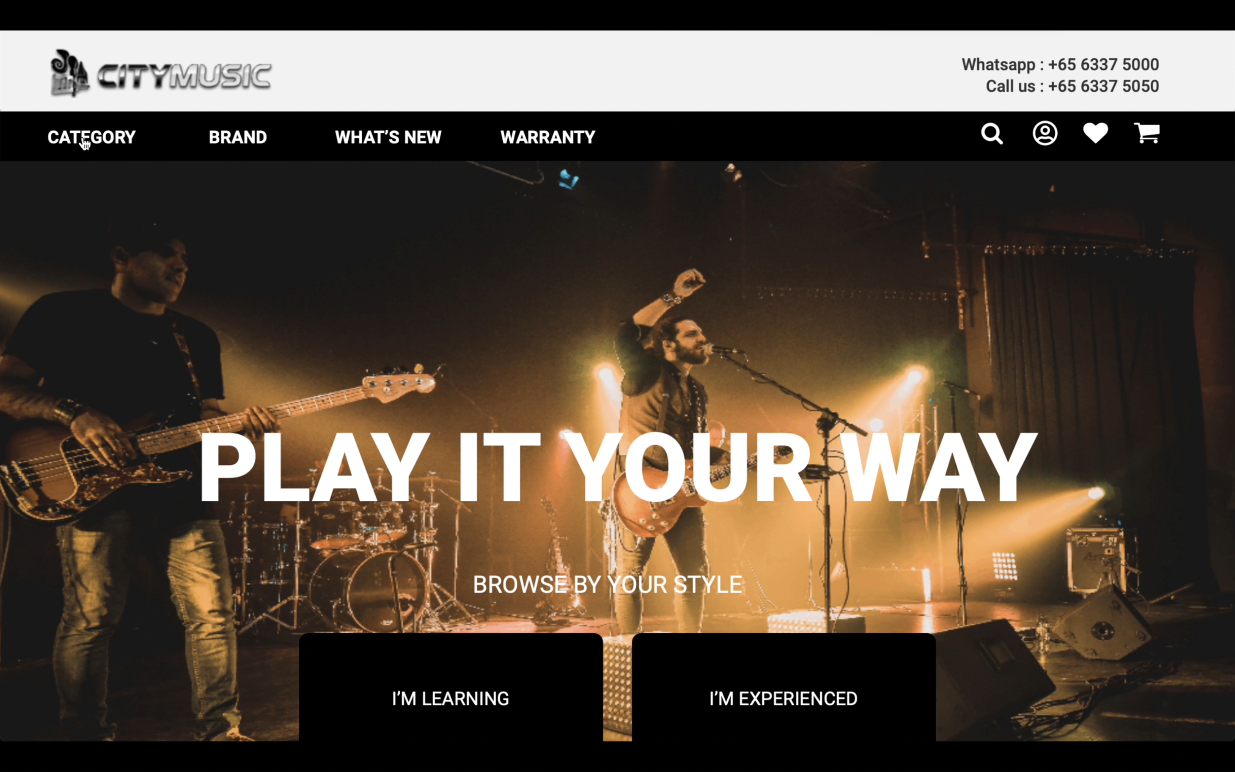
The proposed solution introduces a “Browse by Your Style” call-to-action (CTA) that allows both Shawn and Rachel to explore personalized pages tailored to their level of expertise and specific needs. The application map below illustrates how these CTA buttons integrate into City Music’s existing sitemap.


Ideating Solutions
User Flow
The next step was to outline the user flow, illustrating the potential steps each persona might take when comparing product information and completing a purchase. This flow served as a blueprint for determining which pages should be designed during the wireframing stage.

Wireframes
I created low-fidelity wireframes for the new City Music feature to ensure that users could easily understand its purpose and how to interact with the interface.
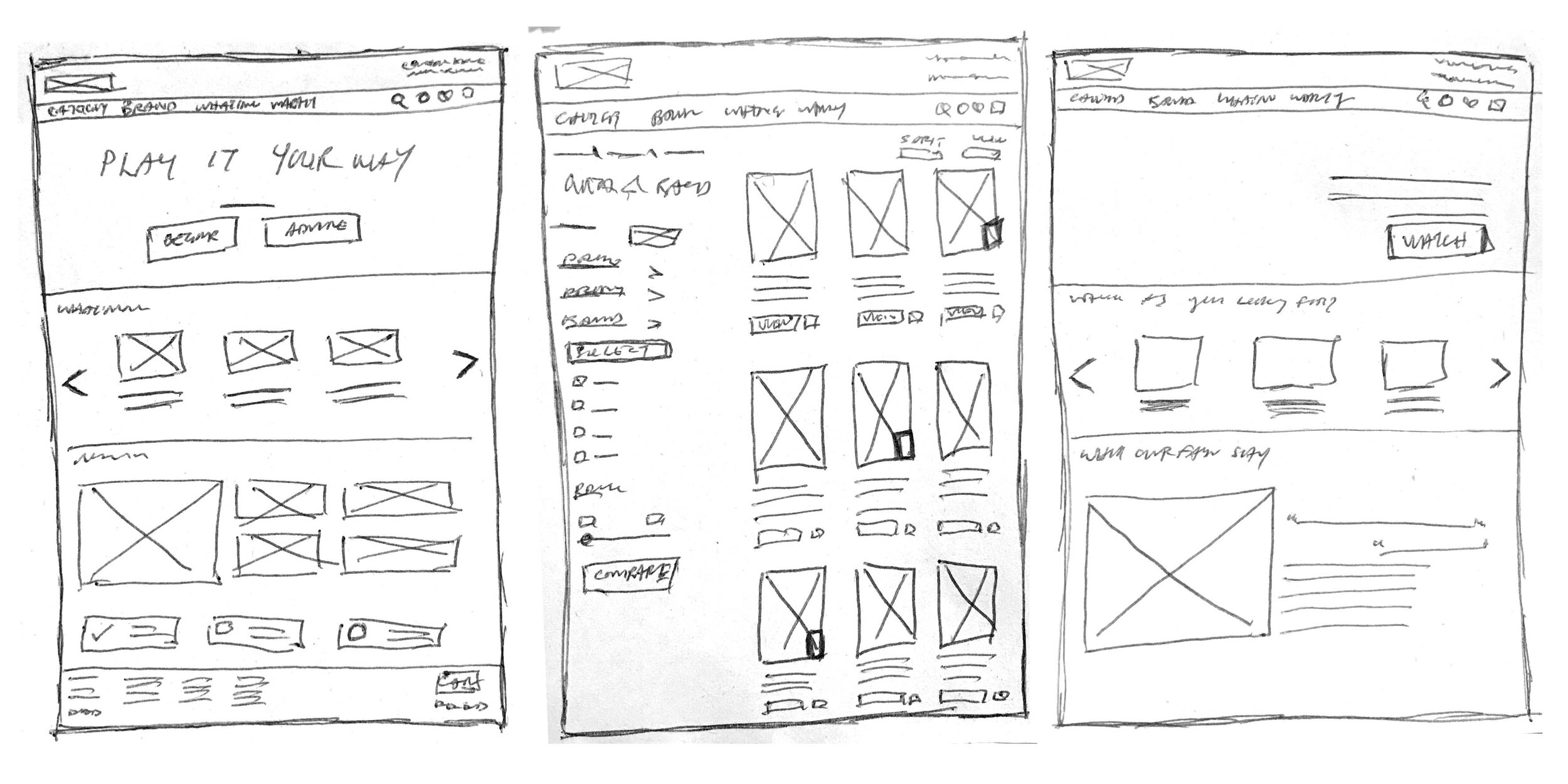
After exploring initial concepts through sketches, I designed high-fidelity wireframes for the homepage, personalized page, product category, product details, product comparison, and checkout pages.

View desktop prototype here
Testing & Iterating
After turning the high-fidelity wireframes into a prototype, I conducted six remote usability tests via Zoom to observe how users interacted with the website and gauge their overall experience.
Usability test tasks:
Users to search and add an item to cart within 3 minutes
Users to search and select items to compare information within 3 minutes
Key Findings
Difficulty in searching for a specific product
The “Browse by your style” function is not clear
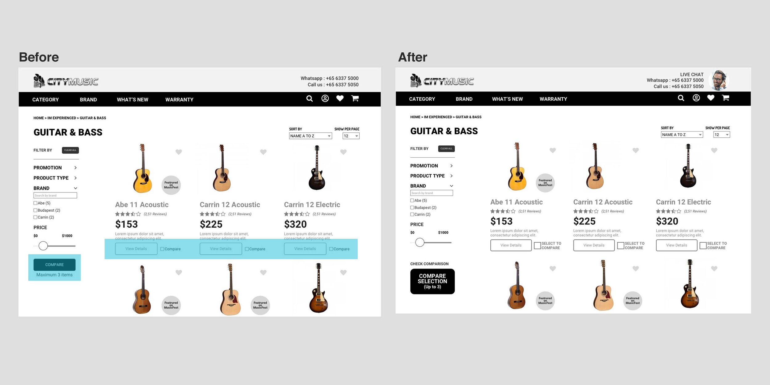
Compare checkbox function were not noticeable, do not know the next step
Compare button was not noticeable to take action
Information was sufficient e.g. videos of review, videos of physical store’s news, product comparison page


Insights from the usability tests revealed that most issues arose during initial navigation on the homepage and when locating the compare function on the product category page. As a result, I focused my revisions on these areas.
View usability test report here
Priority Revisions
Reposition CTA button, revise the text and make CTA button more distinctive
Increase visibility and add more description for Compare Checkbox function and CTA Compare button

Learning Reviews
During the usability tests, the most common issues stemmed from how content was visually prioritized, highlighting the close relationship between content and UX. Clear and effective content helps users understand navigation and enhances their overall experience. When introducing new features, generating awareness and interest through central areas of the website, such as the homepage, is crucial. These tests also allowed me to empathize with users, understanding both their frustrations and joys, and provided valuable insights to inform product strategy. Ultimately, it reinforced that creating or improving user experience is always a collaborative effort.
Next Steps
Improve on microcopy to enhance the experience, reduce friction and get the user to take action
Continue designing responsive UI for easier and clearer navigation such as product discovery, product category, and product comparison
Create responsive web design to respond to more users’ behaviour and environment
Conduct more testing on revised designs, get feedback, refine designs and iterate as necessary

Source: https://www.interaction-design.org/literature/article/ux-basics-and-the-entrepreneurial-iteration